If you’ve done drop-offs at a daycare center, then you’ve seen the brightly colored murals over brightly painted walls. Again, if you’ve visited a hospital ward, you’ve probably noticed the crisp white walls and neutral color selection in the overall themes.
On the other hand, a movie theatre will not showcase neon green lights or bright purples, for that matter. Is there a science to this, or is it pure coincidence?
Have you noticed a color scheme in your office? Does the theme serve any role for you as office workers?
Color psychology has an integral role in our lives, especially in the work environment. It goes beyond brand identity. It has a direct effect on energy levels and office workers' health & wellness.
A suitable design motif can use color and texture synchrony to significant effect. You can play with color to make a space relaxing, uplifting, inspiring, or whatever you need it to do for your workforce.
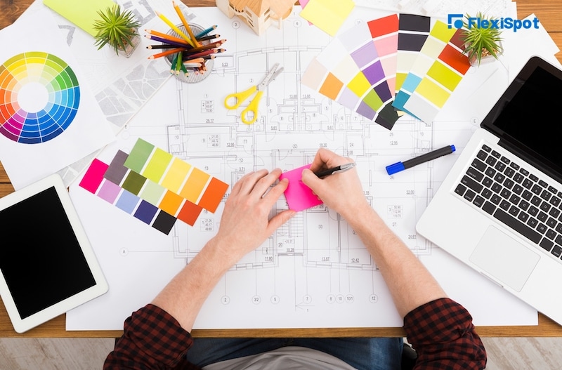
Let's have a look at how you can make color work for you in various scenarios.
Most people are aware of the emotional effects that color has on their general mood and productivity. But did you know that these effects impact life on a physical level as well?
For instance, most fast food outlets enhance their white walls with fast (primary) colors such as red, yellow, and blue. These colors encourage your appetite and get you excited about having a quick meal.
Some argue that our bodies get conditioned to respond in such a fashion. Nonetheless, no one can deny these effects whether we're conscious of them or not. But, how does this track with an office environment?
Interior designers can also play with color to;
Make an office space soothing or exciting
Lower blood pressure
Encourage or suppress appetite
Influence innovation and productivity
You can even use color to boost spatial awareness, transforming a small space into a massive hub of productivity.
Here are some color motifs and the effects they can have on office workers:
Calming Colors
Blues, greens & aqua-marine
These colors complement an overall white theme. They add a calming dash of productivity into an office environment.
Blue and Aqua-Marine Shades
Shades of blue and aqua-marine are said to be tranquil, which breeds peace and a sense of order into your office. These colors can also lower heart rates and soothe blood pressure. Color psychologists also associate these shades with trust and dependability. And, it's not just among you workers but your clients or office guests.
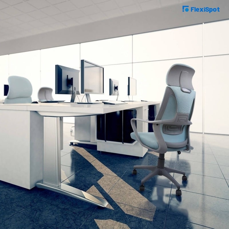
The good news is you needn’t sacrifice your workplace ergonomics when adding blue to your theme. This is because many ergonomic office chairs come in blue.
Green
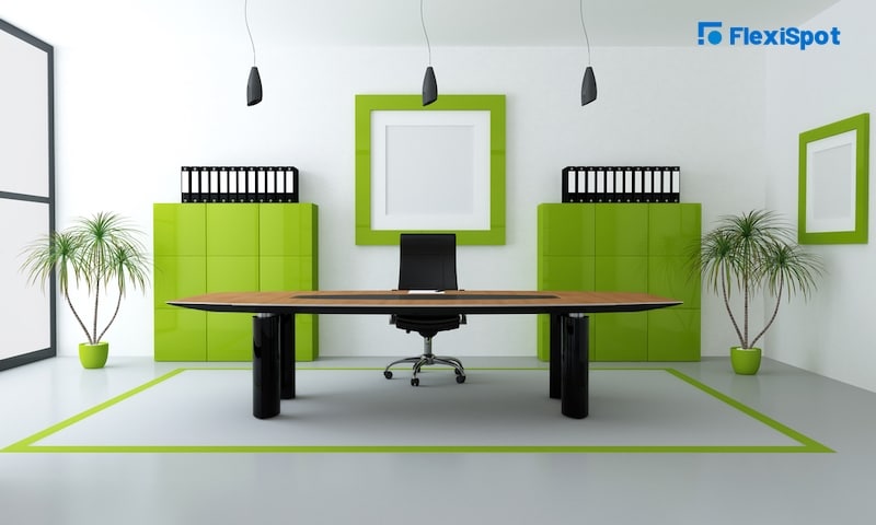
Shades of green are restful, relaxing, and replenishing to the eye. Green is the color of unity, peace, and team spirit. So, you can add a sense of endurance and renewal to your workspace with merely a dash of green.
It doesn't even have to be through painting your walls or getting green office furniture. You can do so with a few potted plants, posters, photographs, or even paintings.
Suitable office spaces
Lounges and common rooms
Conference halls and other meeting rooms
Office space where you conduct loads of research
Adding these colors in small doses should work, but the more space you cover, the more productivity and harmony you encourage in your staff.
High-Energy Colors
Reds, yellows, and their derivatives
Red
Ironically, Red, yellow, and their derivatives are common among gyms and fast food chains. It's also worth noting that Ferrari and other supercars offer red as a primary choice. But why is this so? Well, red is closely associated with the body and speed. It's the color of romance and passion because it encourages proper blood circulation, increased appetites, and a lively heartbeat.
Yellow
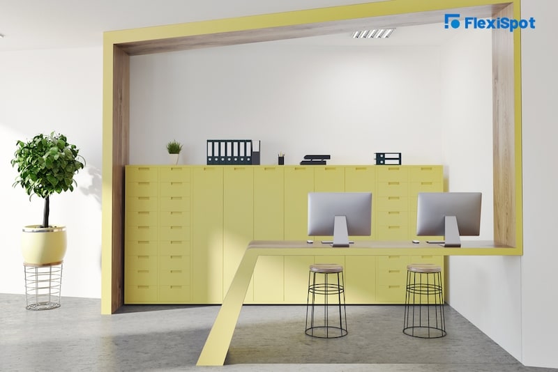
Most people would rather avoid yellow because it clashes with most color themes. But, we assure you that it probably has the most favorable psychological effects on the human frame: color phycologists and renowned artists associate yellow with high intellect and logical pursuits.
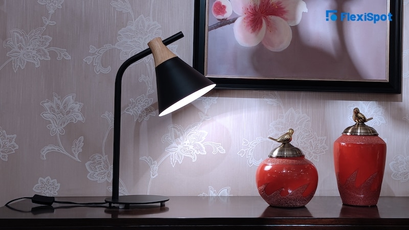
Adding hints of yellow can enhance critical thinking among your staff. A saturation of yellow encourages your brain to release more serotonin (the happiness hormone). A Modern Table Lamp offers a way to add some yellow into your office without upsetting the balance.
Suitable office spaces
Office breakroom or cafeteria
Hallways and other areas of heavy foot traffic
Office spaces where people work overtime or late night shifts
These colors and their derivatives can have a polarizing effect. So, it's best to use them sparingly and in muted tones to not upset the color harmony of your design motif.
Joie De Vivre Colors
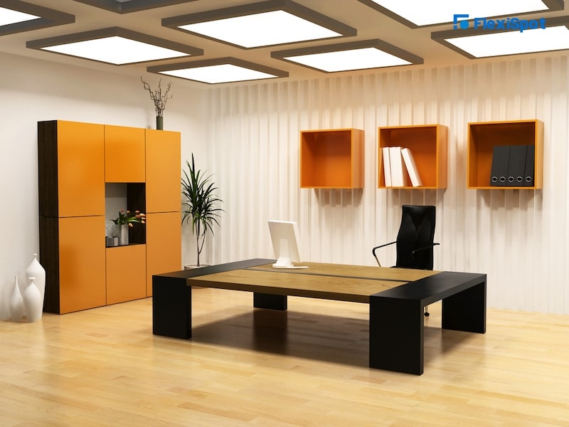
Orange & amber
“Joie de vivre” is a French statement that translates to the joy of life and its reckless pursuit. That's why we tie orange to socialization and effective communication. Orange inspires curiosity and creates an environment where people want to learn new things. So, teamwork, creativity, and conversations thrive under the glow of orange.
However, subtlety is critical. You can get away with orange mobile file cabinets and other shared office furniture or accessories. This allows you to add a little beauty and curiosity without sacrificing warmth or clashing with different colors in your environment.
Suitable office spaces
Tiles and carpeting
Spaces with loads of computers
Storage spaces and related accessories
Orange is also helpful in highlighting potential hazards so you can add it to safety signs. Amber and shades like ochre play well with most colors.
The Color of Creativity
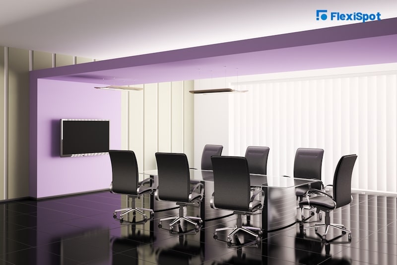
Purple
Throughout the middle ages, Historians closely tied purple to royalty. Developing purple dye was too expensive for the commoner, and only royal families could afford purple garments and decorations.
Fast forward to now, and we have the technology to make purple widely available. But, purple still maintains its regal and creative roots. It's a shade of blue, so it comes with similar but somewhat muted attributes.
Purple is calming enough to ensure lower and sustained blood pressure. Mixing it with red promotes a sense of understanding and wisdom. So, it can come in handy to brighten up bland cubicles, injecting more dynamism while reducing overall stress levels in your office space.
Suitable office spaces
Break rooms
Cubicle walls
Washroom
Entranceways
The Colours of Abundance
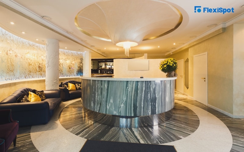
Metallic shades
Gold, silver, and bronze were popular forms of currency before we had "paper money." And they remain valuable metals to this day. That's why medals feature such metals and luxury brands like incorporating them in their branding.
Gold
Gold is a status symbol that inspires a sense of influence and success. Adding it to your office design theme allows you to harness the power of the sun and masculine energy. Although you can't go overboard, it harmonizes with black, white, grey, and other muted tones.
Silver
This color works in a similar but slightly contrasting way to gold. Silver takes the sensitive power of the moon and adds a dash of feminine energy to your office environment. Not only does silver blend well with light colors. But, it also makes your overall design motif appear more sophisticated. That's why it's right at home in a hi-tech office full of computers or wall-to-wall servers.
Bronze
Bronze gets its brown tone from a process that mixes tin and copper during processing. It’s a little muted when compared to silver and gold. So, most people associate bronze with maturity and staying true to your roots.
Adding it to your office theme through texture and color gives your staff and customers a sense of longevity, confidence, and experience.
The Colors of Stoicism
Subtle grey, white with hints of black and brown
Stoic shades like white and grey are the foundation of nearly every office space on this planet. So, a review of commercial colors schemes is incomplete with their mention.
To most people, grey and white seem to be bland. Some would even venture to say that white is the absence of life or color. But, you can never go wrong with these colors. Their stoicism holds even if you try to blend them with crazy shades of neon.
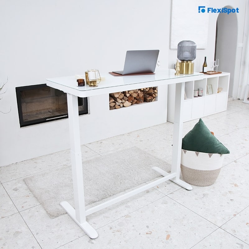
For instance, an all-in-one white standing desk with a glass top fits anywhere. It preserves the overall color balance. Plus, it adds an enhanced sense of cleanliness and purpose to your office space.
Working grey textures through related office accessories can help you make your office space more welcoming. Mixing both colors is the perfect way to convert any room into a fresh and soothing area of enhanced productivity.
Suitable office spaces
Reception
Office gyms and other recreational space
Conference rooms that need loads of natural light
Achieves libraries, drafting rooms, and other spaces for research and collaboration.
It’s also worth noting that white and gray are boring on their own. So, feel free to combine stoic shades with other colors. A color clash is highly unlikely.
Color psychology recapped
So far, we've thrown around a bunch of random colors and their emotional attributes. But, it's probably not clear how you can stir them together to make your office space more vibrant or conducive to your core business.
Here are some suggestions to help you make it all work to your advantage:
Green and aqua-marine shades are excellent for areas where employees work long shifts. These shades calm down anxiety and significantly reduce eye strain.
Shades of blue are excellent for common areas and open office areas where employees collaborate over projects.
Hints of yellow, orange, and earthy tones enhance creativity and energy. So they work well wherever you want to optimize space in your office.
White and grey are ideal for open office space, but they drown under the influence of brighter colors. So, they work best in lobbies, breakrooms, and other office spaces where you'd like to enhance the sense of spaciousness.
Conclusion
What's the significant takeaway here? For one, color choices directly affect the way we perceive an office space and work within. Color psychology has an emotional and physical effect. So, even the most subtle of changes can have surprising results.
As you can see, playing around or switching colors up isn’t that challenging. You can repaint your walls or outsource the task to an interior design firm. Although, it may be more prudent to upgrade to the latest ergonomic office furniture to get the best experience.
We hope this brief guide helps make this an easy and rewarding process. As always, feel free to share this article and comment, especially on things we missed.
